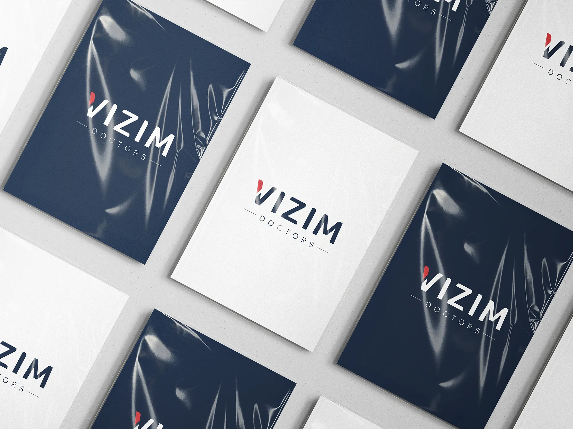
Rebranding
A New Brand Identity
for a New Era of Business
Rebranding is never a one-way process, especially when the outcome needs to signal change and refreshment while maintaining continuity with values and traditions that have lasted for nearly three decades.
Changing the logo, colors, and typography, along with establishing new standards in brand communication and logo application, is not only a creative but also a strategic challenge. The solution lies in understanding the principles of visual communication and skillfully translating them into specific shapes, colors, and their interrelations.
Logo and Trademark Redesign
Typography, Colors, and Logo Application
OOH Advertising
The First Private Healthcare Center in Serbia
Branding and Visual Identity
Print Production
Content for Print Materials
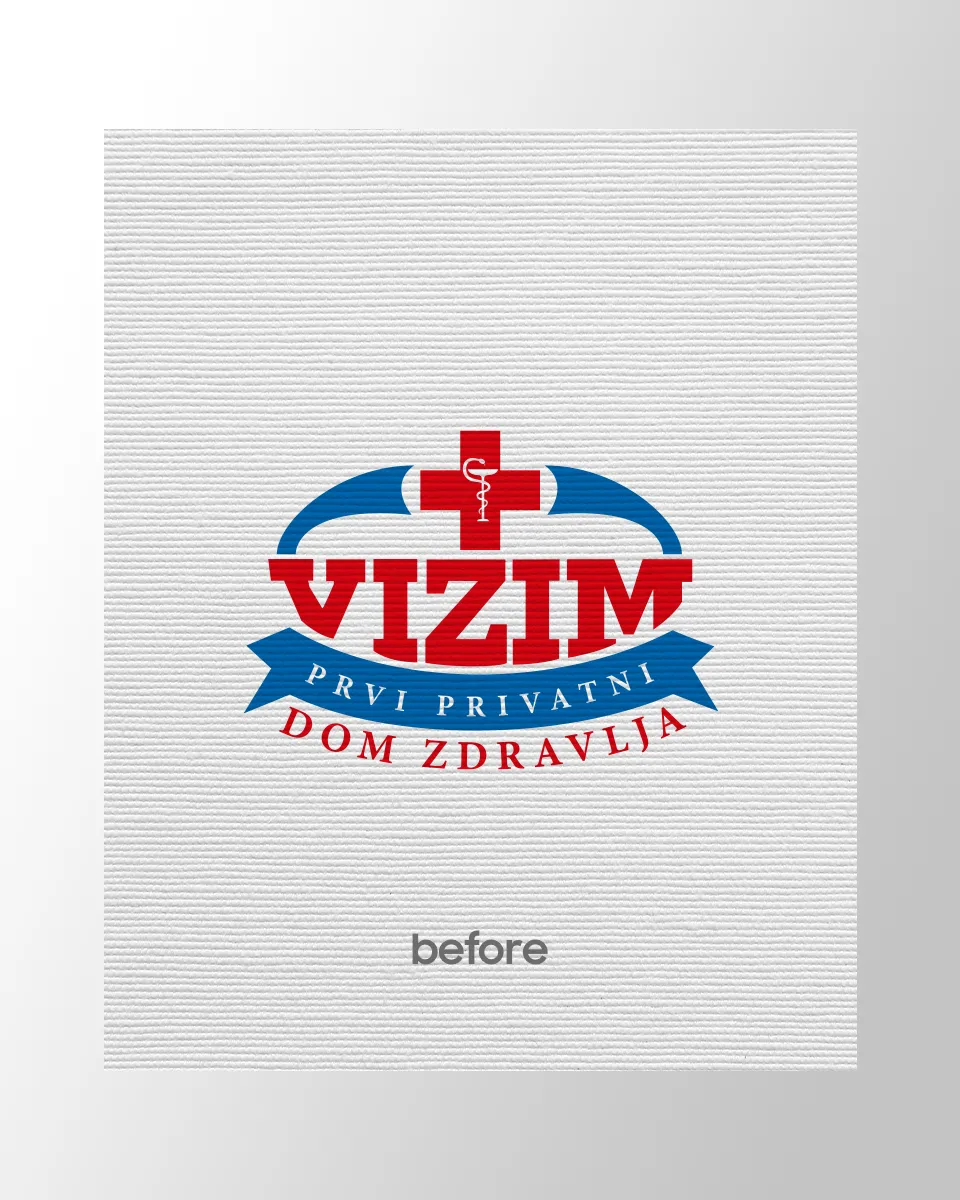
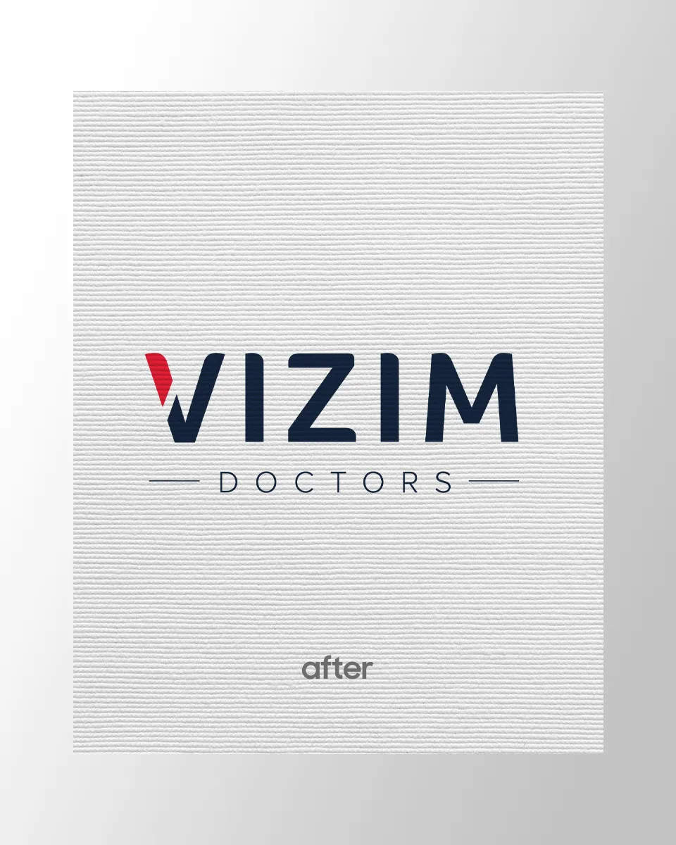
Alongside the logo redesign came a new branding campaign through OOH solutions and applications across internal and external corporate materials.
A series of billboards featuring the new logo and brand messages integrated the dichotomy of change and continuity, announcing a new era: major transformations in services expansion and business platforms of the oldest private healthcare center in Serbia.
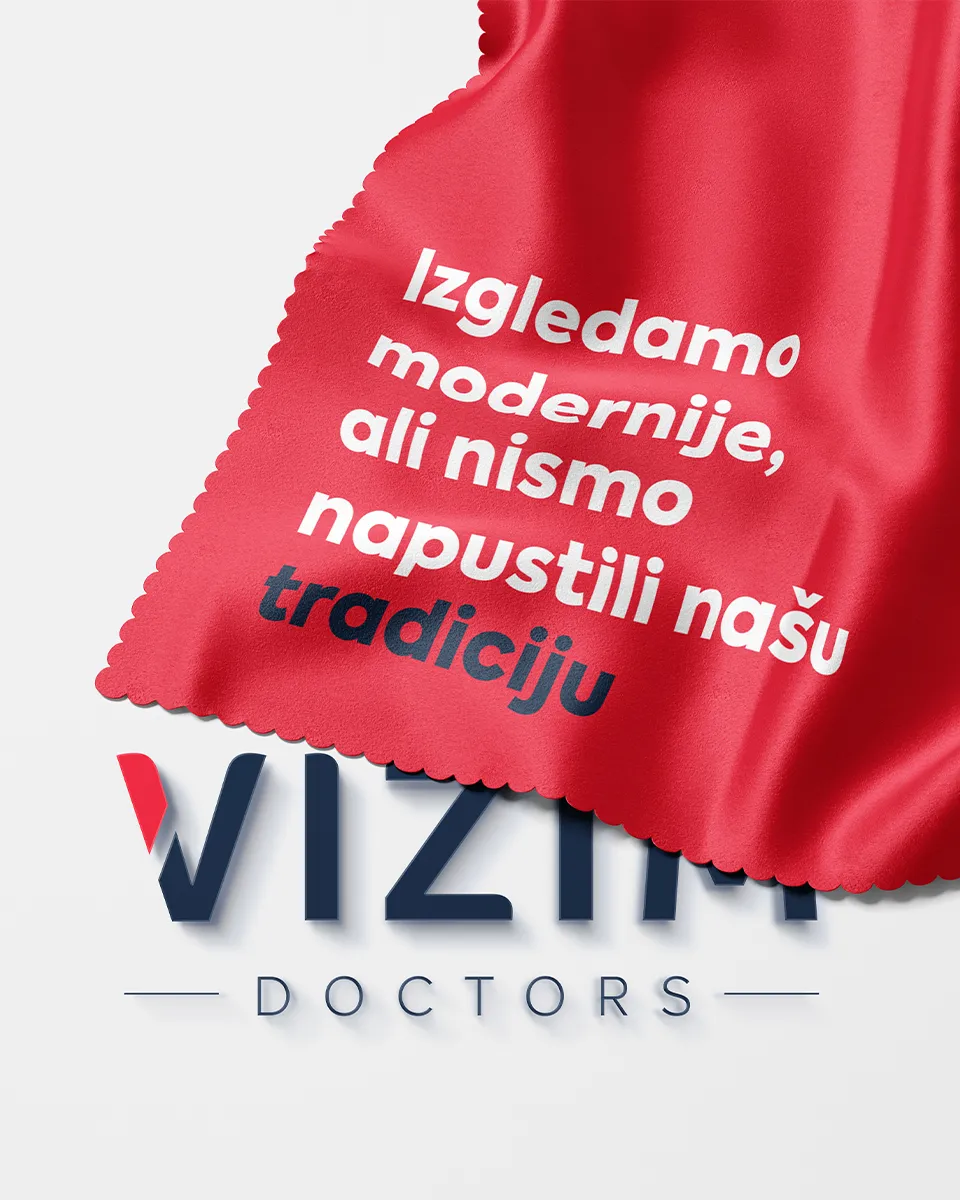
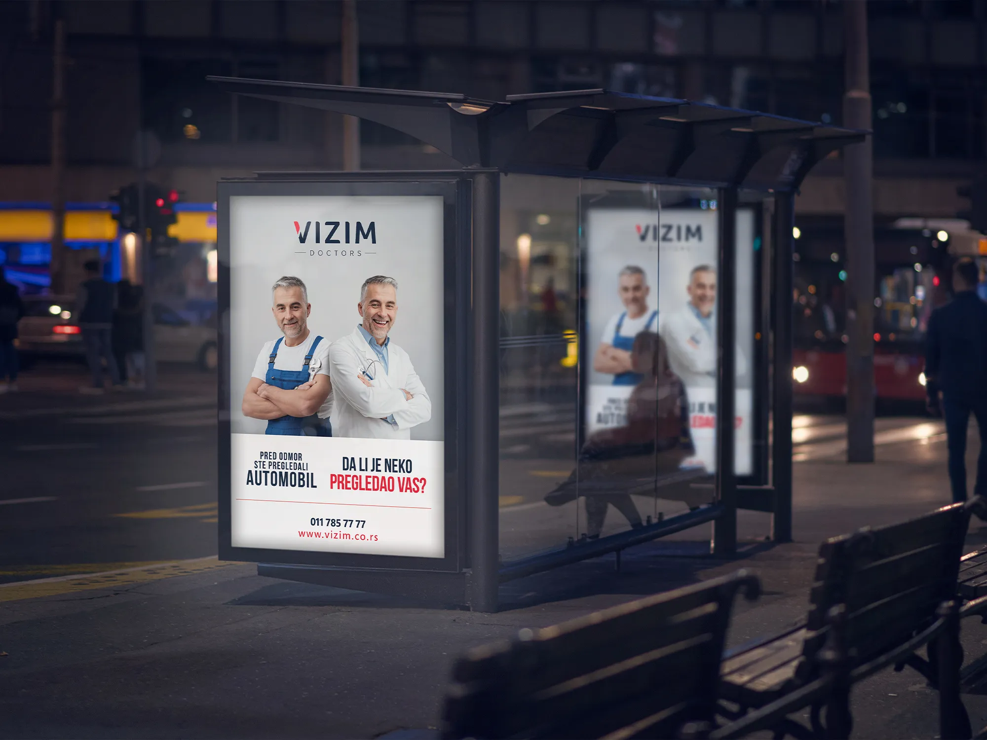
The billboard communication of Dom zdravlja Vizim, now Vizim doctors, has been under our management since 2018. Amid a whirlpool of universal, always relevant solutions, seasonal campaigns, and communications for specially tailored offers, we can’t say that one is dearer to us than another.
Still, we can say that the entire communication of the new logo and visual identity holds a very special place in our hearts.