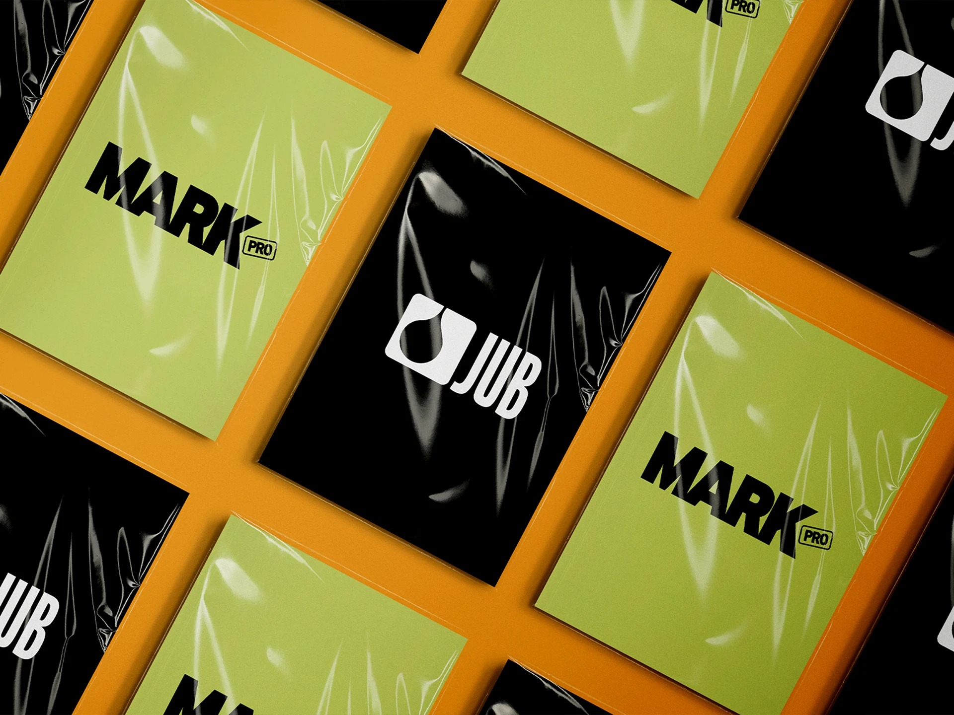
MARKpro Packaging redesign
Storytelling
Without a Word
Consumer attachment to product packaging is nothing new: packaging is often the first message manufacturers send to their customers. A packaging redesign that aims to modernize and simplify a product line while maintaining its informational function is comparable to cosmetic surgery – the outcome must be a clear enhancement, but the change should not be obvious or fundamental.
Even after years of experience working with the umbrella brand JUB d.o.o., this project was an exciting challenge: knowledge of JUB paints and products wasn’t enough to fully understand the entire system of building materials.
Trust of the Umbrella Brand JUB d.o.o.
Modernization of the Product Line
Improved Packaging Communicability
Packaging Facelift
Branding and Visual Identity
Web Design and Development
Digital and Print Production
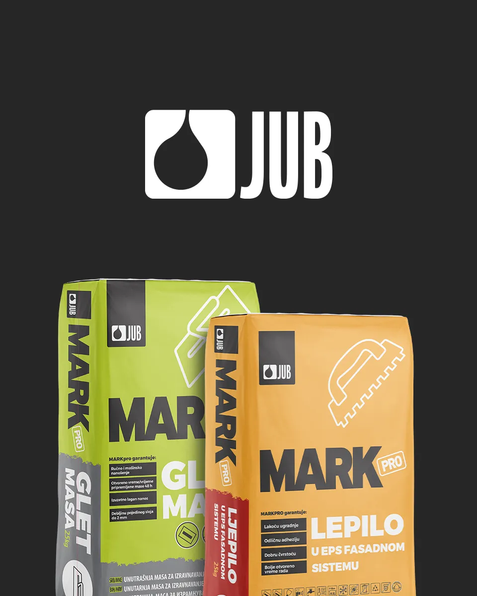
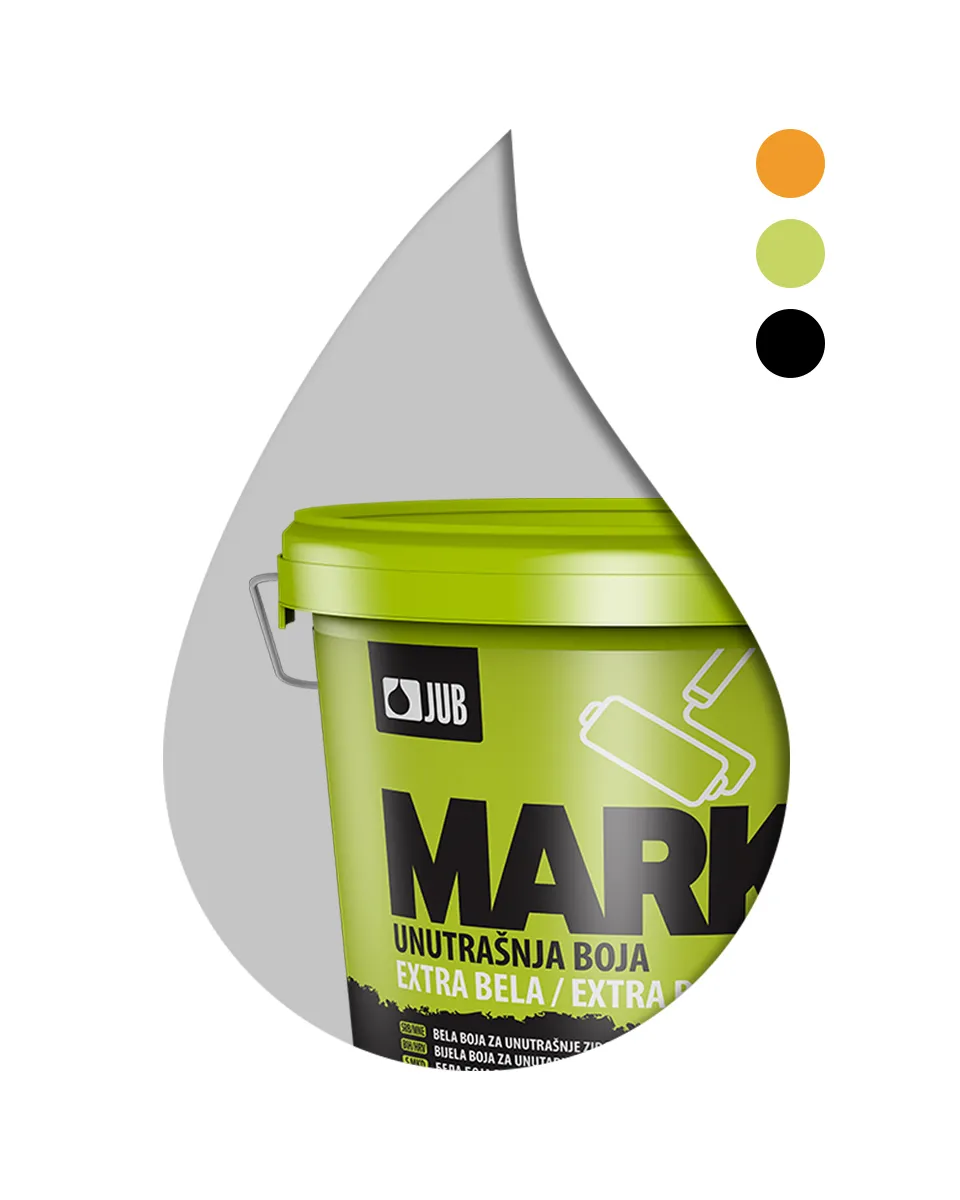
We began the redesign process with serious learning – from understanding the difference between materials for interior and exterior walls, to mastering primers, skim coats, facade and interior paints, as well as smooth and rough plaster. Only then could the real work begin.
The main applications and usage steps, as well as the recommended conditions for use and storage, all had to find their place on the redesigned packaging. That’s why in the refreshed MARKpro product line, pictograms have a prominent role, ensuring clear and effective communication.
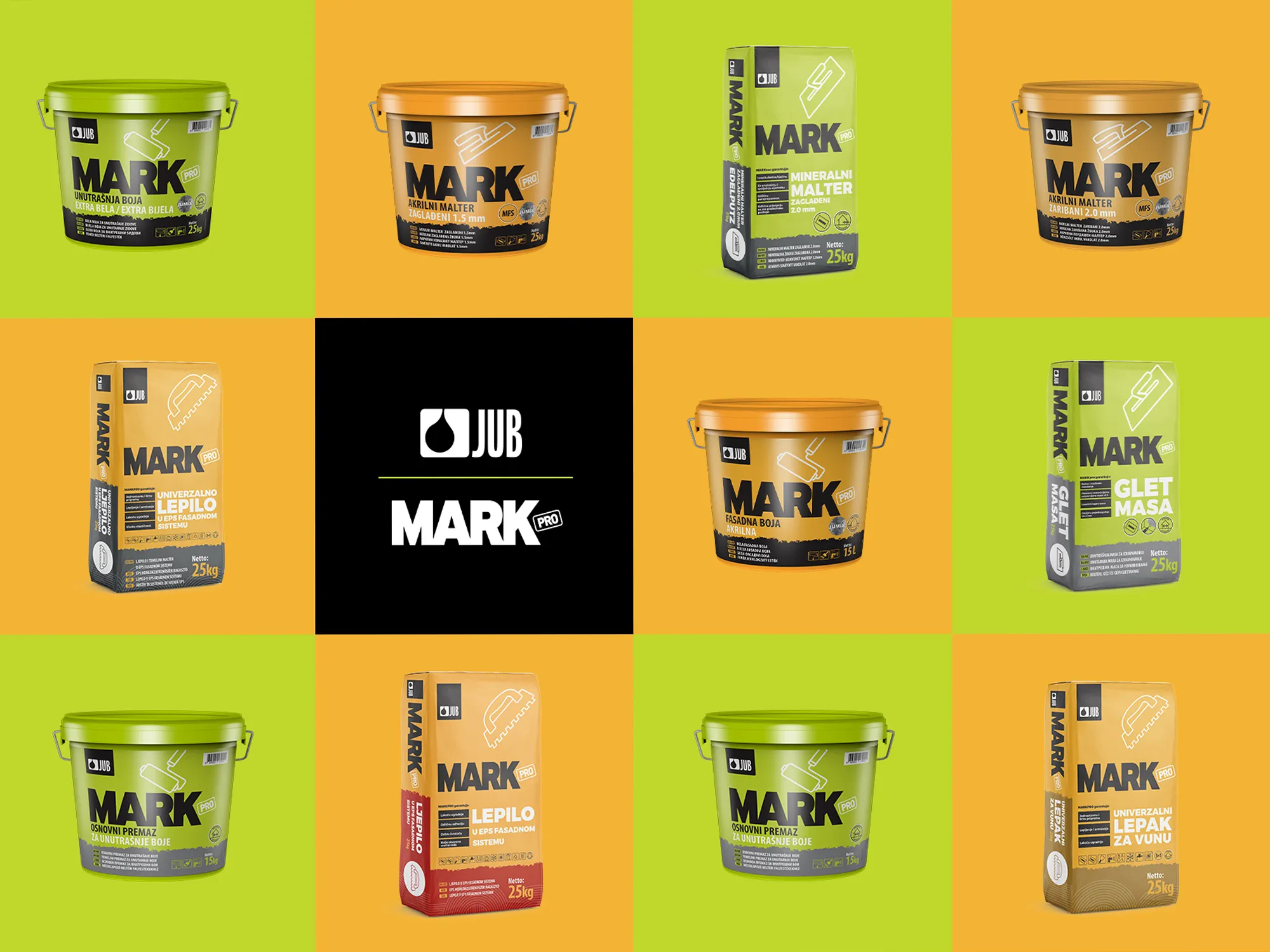
Although the MARKpro product line had already been on the market for a decade, we knew that packaging itself serves as a guarantee of product quality. That’s why we decided not only to redesign the MARKpro logo but also to highlight the umbrella brand’s logo on the packaging.
This way, the entire target group – both professional contractors and end-users – could clearly see that the quality is guaranteed by the oldest manufacturer of wall paints in the region.